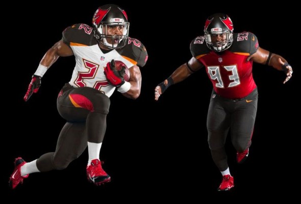
For the last 17 seasons the Tampa Bay Buccaneers have had some pretty solid uniforms. They won Super Bowl XXXVII in them, they had a franchise revival in them,and have been in a demise in them since. Recently the team updated their helmet logo and made it extremely oversized. I mean,seriously, we know you’re the Buccaneers, you don’t need to overdo it.
Tuesday the team unveiled their new uniforms that were allegedly supposed to have minor tweaks to them. Instead,they have gone another direction…
According to the team the new uniform “honours the Buccaneers’ rich tradition while boldly bringing the team into the future through a modern industrial design aesthetic”. 
The red has been lightened from the previous set,with the orange from the team’s early days becoming more prominent in the uniform. The numerals are supposed to represent carving marks from the sword of a pirate.
“Today marks the culmination of more than two years of research and planning to bring the Tampa Bay Buccaneers into a new and exciting era of our history,” Buccaneers co-chairman Edward Glazer said. “We worked closely with our partners at Nike to design a uniform that would set the standard for both design and functionality.
Personally, I think these uniforms are absolutely ugly looking. They are not only too busy, but the numerals look like they came from a 1980s alarm clock. I also had no idea that Nike had hired the same people who designed the XFL’s uniforms to do this team’s redesign. Look, the Buccaneers had a good thing going with the uniforms they previously had. The saying “If it’s not broken, don’t fix it” truly applies to them. It also makes me cringe to see what other teams who don’t necessarily need uniform changes will do to fuck their uniforms up just like the Buccaneers did.
My hope is that they switch back to what they had before, they’d be better off as a team.
Thumbs Down!

