 I know that the Dolphins’ new logo was released not too long ago, and by released, I mean leaked by someone else prematurely,eventually forcing the Dolphins to acknowledge it and unveil it earlier than planned. In any case, I will review it now.
First of all, I don’t know exactly what the hell was wrong with their logo in the first place. I thought it was fine,I thought it looked traditional. I didn’t think they needed a new logo. Ever. And by the looks of their new emblem, I think I am right.
This is not a good change for the Dolphins, I said this on Sports Madness last Tuesday, it looks like a cross between a logo for tuna fish and a tramp stamp that you’d see on the lower back of a 35-year-old woman who got it when she was 17 rebelling against her parents. It’s not menacing or makes anywhere close to fearful. The Dolphins need to know that if something isn’t broken, don’t fix it.
 Now onto the uniforms, apparently the Dolphins are embracing a return to the use of all white away uniforms (or home if it’s hot outside early in the year), and to be honest, I think they can use some teal pants. I thought the uniforms looked fine with teal pants.
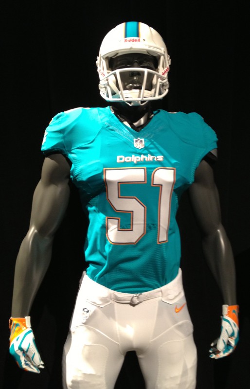
Also, where the heck is the orange in the uniform? There’s barely any there. As a fan of the color orange, I think they should have added a little more orange than they did in this redesign.
Both sets of these uniforms could use more in creativity and imagination. Maybe some stripes on the sleeves would look good. I do like that they dropped the shadow numbers, something that’s so 1990s.
Overall, Miami needs to go back to the drawing board with these. I’m glad they want to go somewhat retro, but do it with a dolphin wearing a helmet with an M on it.
Thumbs Down!

