Not too long ago, I reviewed the 76ers new(ish) logo and I very much liked it despite there being not that much red. On Thursday, the team unveiled their new uniforms.
Three different eras are represented in the new uniforms-1967,1977,and 1983. The PHILA across the chest is representative of the 1967 team that won the NBA championship. The stars on the sides are reminiscent of the Sixers of the mid-70s (1977 in particular) and the trim on the neck and arms of the uniforms are like the 1983 uniforms that had the same style of trim.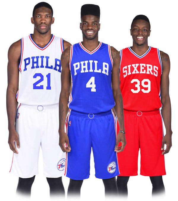
The home whites have PHILA in blue block letters with blue numerals. The trim on the sides is blue with white stars and a red stripe on the outside of the trim. The jersey has seven stars on the sides and six on the shorts (representative on the number 76).
The road blues also have PHILA in white block letters and white numerals,white trim on the sides with blue stars and a red stripe on the outside of the trim as well as the same amount of stars as the home uniform. The red alternate uniforms read SIXERS on the front of the jersey in white block letters with white numerals. The side trim is white with red stars and a blue stripe on the outside of the trim. This uniform is based on the ones worn by Dr. J and the 1983 team that won the NBA championship,the team’s last title.
I do like these uniforms a lot. I don’t like everything about them,but I do like them. I don’t like PHILA across the home and road uniforms, I prefer the team wearing SIXERS on the uniforms myself. I do like the stars on the sides and the clever use of seven stars on the jersey and six on the shorts. One thing I really like that many people may never notice is the circle of 13 stars on the belt of the shorts, representing the 13 original colonies of America.
These uniforms are in many ways similar to the set they wore for the last six seasons,but they are an upgrade. I don’t know why a lot of people didn’t like these, maybe because of PHILA on them, but overall,it’s a clean,classic and sharp look that for years has been missing in this league for a while.
Thumbs Up!

