 When I heard the 76ers were updating their logo, I thought “What the hell for?”. I thought they were fine with bringing back the logo they had from 1963-97 before jumping to the old black,gold,blue,and red scheme during the Iverson era, what was the point of making any change to an almost perfect logo?
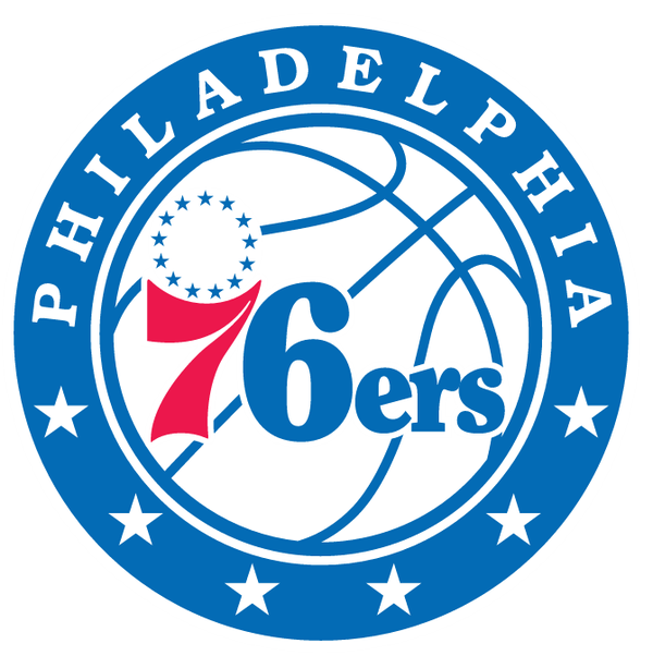
The old logo, used since 2009, was the 1963-97 logo cased in a red rectangle with Philadelphia in a smaller blue rectangle at the bottom. That has since been changed to the modernized white basketball with the traditional 76ers’ wordmark on it, the white ball is enclosed in a blue roundel with Philadelphia arched over the top in white and six stars on the bottom.
The team also unveiled three alternate logos, one of them includes a 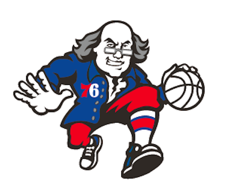 caricature of Ben Franklin dribbling a basketball,which I think looks pretty freakin’ sweet. New uniforms will be accompanying this new logo next month which have been said to be a mix of the 1960s,1970s,and 1980s uniforms.
While I think the logo could’ve used a little more red somewhere, I do like it. It’s a modern twist on a classic logo that may or may not have needed to be redesigned. But since it was,I think the Sixers did a good job on tweaking a classic. Now if they can ever get back to winning actual basketball games instead of the most ping-pong balls in the NBA Draft Lottery,that would be a sight to see.
Thumbs Up!

