The Jaguars’ previous logo used from 1995-2012
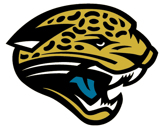
 Many of us know the Miami Dolphins have been rumored to be changing their logo,but it’s a different Florida team that has unveiled a new logo, the Jacksonville Jaguars. That happened Tuesday, it is the first change of a logo in their 18-year history.
Gone is the sleek looking Jaguar head and in its place is a new Jaguar head that is less sleek but keeping the same teal tongue as the former logo had. Also in teal are the cat’s eyes. Teal seems to not be as prominent as it once was when the former logo was around as the team seems to be focusing on having black and gold as the primary colors.
I am going to surprise a lot of people here, I don’t think this logo is much of an upgrade. I thought there was almost nothing wrong with the logo they’ve had their entire history. I thought what needed to be changed were their uniforms because of how they plain they were. I think the logo isn’t going to look as good on a helmet like the old one did. The black and gold together will look fine with some splashes of teal on it, but this could’ve been achieved without a logo change. Just sayin…
If there is one positive about it, I do like the spots on the head of the jaguar, they look more realistic than they did on the previous logo. Overall,change the uniforms, not the logo.
Thumbs Down!


I like it….looks much more cat like, less cartoonish than the last logo.
I still feel like both logos are cartoonish. The new one looks more realistic but both still have that drawn element. I’m not sure what they should do but this is meh to me.
I am with Mappquest for the most part. It seemed like an unnecessary thing for the Jaguars to do. How about spending that money you spent designing a new logo and getting some key free agents to help your team actually win more than twice a year?