For about a year now we have known that the Cleveland Browns were getting a logo and uniform change. The uniforms will be unveiled in mid-April, but on Tuesday the new logo was.
Here it is.
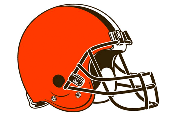
You’re probably wondering “Okay,what changed? It’s their helmet. Again!”
Well,the helmet did change a bit. The shell is still orange, but a brighter hue of orange,and the facemask color changed from grey to brown. The stripes are still brown and white and the side of the helmet is still without a design on it as agreed when Jimmy Haslam bought the team from Randy Lerner a couple of years ago.
But yes,the Browns are still using their helmet as their primary logo,which they’ve done since the 1970s.
However, there is a new alternate logo for the Dawg Pound,the team’s passionate and victory starved fan base. There it is below and to the left.
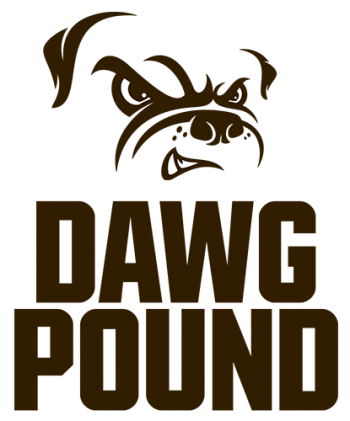
The new Dawg Pound logo
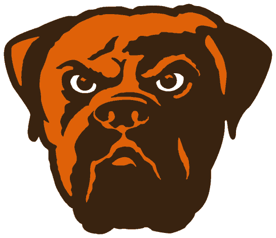
The old Dawg Pound logo
Honestly, I liked the old Dawg Pound logo better, that one looked pretty cool and was even decent enough to be the team’s primary logo.
I am kinda disappointed that the Browns continued with a helmet as their logo. They could’ve updated their old brownie elf logo, or even could’ve gone with the old Dawg Pound logo as the primary one as I mentioned before, but to use the helmet is just lazy and made any anticipation for the team to use something exciting and new pretty much a waste of time. I do like the brighter shade of orange and the brown facemask,though. Other than that, it’s just kinda boring and half-assed to me. Hopefully the uniforms make this “change” worth it.
Thumbs Down!

