The Toronto Raptors will look a little different come next season. The team unveiled their new uniforms late Monday night. The club introduced a new home uniform,a new road uniform,and two alternate away uniforms.
The new look is paying tribute to Toronto and to being the lone Canadian NBA team. The team’s primary colors remain red and black, but they also silver and gold as alternate and accent colors.
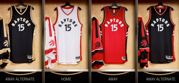
The home uniform is white with red trim on the sides, RAPTORS written in black block numbers and black numerals outlined in silver. The main road uniform is red with black trim, RAPTORS written in white block numbers outlined in silver. The main road alternate is black with red trim,RAPTORS written in white block numbers and white numerals outlined in silver. The secondary alternate,known as the “Drake” alternate because rapper Drake,a Toronto native,is a team ambassador, is also black with gold trim, white RAPTORS script with white numerals outlined in gold. The names will appear arched in the same block letters around the number on the back of the jersey.
The shorts have a T on the side which leads down to the logo on the shorts,creating the letter O. T.O. is another nickname for the city of the Toronto (standing for Toronto,Ontario).
I’ll be honest, I like the new logo quite a bit,but the uniforms could use a little help. First off,ditch the Drake alternates. We don’t need them and they have more to do with Drake then they do the Raptors. Secondly,there’s no uniform that says TORONTO on the front? Not one! That’s pretty outrageous if you ask me. Also,using the same block letters on the back for the player name as they do the team name on the front seems like you’re doing these uniforms on the cheap.
Overall,they’re not bad,but this new uniform set needs a little help and that’s why I’m saying they’re only Okay.