With the Stanley Cup Playoffs underway, I thought it was time I revealed my list of the NHL’s greatest uniforms. There have been many great uniforms over the years, and compiling this list was hard (even harder than our NFL list back in 2011), so that might explain it’s long awaited premiere. So,here we go with the list.

10. Dallas Stars (1999-2007)
This was an awesome look for the Stars when they won their only Stanley Cup thus far in 1999. The Star outline on the jerseys combined with the green and black colors made it a winner in my view. Some may think it didn’t look that great because, let’s face it, a lot of the NHL uniforms from the 1990s were bad (See: New York Islanders 1995-97), but this one was one of the few that did. I thought the look they switched to later was pretty bland and boring. I hope their new set can be as vivid as the ones they wore when they drank from Lord Stanley’s Cup in ’99.

9. Montreal Canadiens (1950s-Present)
Such a classic look for a classic team. The Canadiens look dates back to the 1950s and they are one of the few teams in hockey where the home set doesn’t match the away set. I love the home set with the blue and white sleeve and chest stripes on the red jersey. The road set looks great with the red shoulder bars and the red sleeves and the red and blue stripes on the bottom. Both sets are paired with blue pants. It’s been the team’s signature look for so long and so many great teams have hoisted Lord Stanley’s Cup in it. I don’t see it going anywhere anytime soon.

8. Boston Bruins (2007-Present)
The Bruins have always had great uniforms, but their current set looks the best. The reason why? It looks very classic with the gold shoulder bars (or black on the away set) and the sleeve stripes and the stripes on the bottom make it a great look,paired with the black pants, of course. I think the thing that makes the home uniforms look as sharp as they do are the gold socks with black stripes.
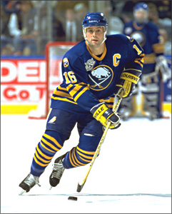
7. Buffalo Sabres (1970-96)
The Sabres’ initial look from the time they entered the NHL in 1970 until the Billy Goat look came about in 1996 was slick. I love the Sabres’ crest and I am glad they went to an updated version of it in 2011. The home set has the gold stripes and gold numbers while the away set has a good balance of blue and gold all around,including the blue shoulder bars. Both sets have blue pants. Why they ever went away from this look and these colors is something I don’t understand, but then again the 1990s brought us a lot of weird uniforms.
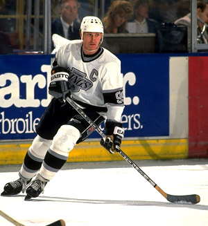 6. Los Angeles Kings (1988-98)
Wayne Gretzky came to the Kings in 1988 and at the same time the Kings changed their colors from purple and gold to black and silver and they looked awesome. I love the Kings’ home white uniform with the silver numerals (later black in 1992) and the sleeve stripes with the number inside of it. The away black jersey looks by far the best with the silver numerals and thesilver and white stripe pattern. Both jerseys had black pants paired with them. Such a great look that should’ve been around longer. I am glad the Kings went back to these colors,though.

5. New Jersey Devils (1992-Present)
I’ll be honest, I didn’t like the Devils in red and green. Many people did,but I thought the green was too much.
I think the red and black look works for them. The red home jersey with the black shoulder bar and the black and white sleeve stripes looks agreat as does the home jersey with the same shoulder bar in black and the red and black stripes. Both sets have black pants. I have always wondered if they’d ever introduce a black third jersey with a red shoulder bar and a pair of red pants, but to be honest,they don’t need to. Their look has stood the test of time and the Devils have been three time Stanley Cup Champions in them. A great look for a great modern dynasty.

4. Chicago Blackhawks (1964-Present)
The Blackhawks have such a solid look. Dating back to 1964, their red home jerseys with the black and white stripe pattern look so sharp. The away whites with the black and red stripes are also a great,classic look. They did have a black alternate jersey for a while, but to be honest it didn’t look that great, at least not as cool as the regular home and away set. What other jersey would you rather see Wayne Campbell and Garth Algar play street hockey in?
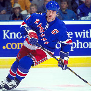
3. New York Rangers (1940s-1976, 1978-Present)
The Rangers are one of the few teams that can get shadow numbers right. I’m not that big of fan of them,but on the Rangers they look great. The blue home jersey with the sleeve stripes and the white shadows on the numbers are such a classic look. Their away set with the shoulder yoke and the red and blue stripes is nice as well. Even their alternate blues look great,too! I think the thing that pulls the uniform off is the red pants for all three sets. They really tie the uniform together.

2. Edmonton Oilers (1979-96,2011-Present)
Okay,I admit that as an Oilers fan that, to some, I may have put them high on the list on purpose. But can you blame me? These uniforms are absolutely awesome!
I love the stripe designs on both sets, the shoulder bars outlined in white on the home jersey (and in orange on the away), the orange sleeves on the home jersey complete with the blue pants, it’s such a great look complete with that sweet Oilers’ crest in the middle. For 15 seasons, the Oilers went away from these uniforms and these colors and changed to midnight blue,copper,and red. I gotta say that that move was a bad one. I am glad they went back to this set of uniforms two years ago. It was the look of their glory years and I’m hoping the Oilers can have many more glory years in them. I am proud to own a blue home jersey and I must say I look damn good in it!

1. Detroit Red Wings (c.1950s-present)
The Red Wings have the best look in hockey. The simple red jersey with the white numerals and white stripes is so classic that it does not need to be changed. Ever. The white away jersey with the red sleeves and red numerals also a very classic look. They’ve never had to make too many changes to these in all the years they’ve worn them and I’m glad. They’ve even used the same winged wheel logo since 1948. This is the best uniform in the NHL and it may still be for years to come.
